Question from a user…
I received an email today which I would like to answer in a blog post as I think it will be helpful to all:
“Is there a simple way to add a chart of VIX overlaying %B*BW of VIX? it would be nice if it was automated in the program.”
How to do it
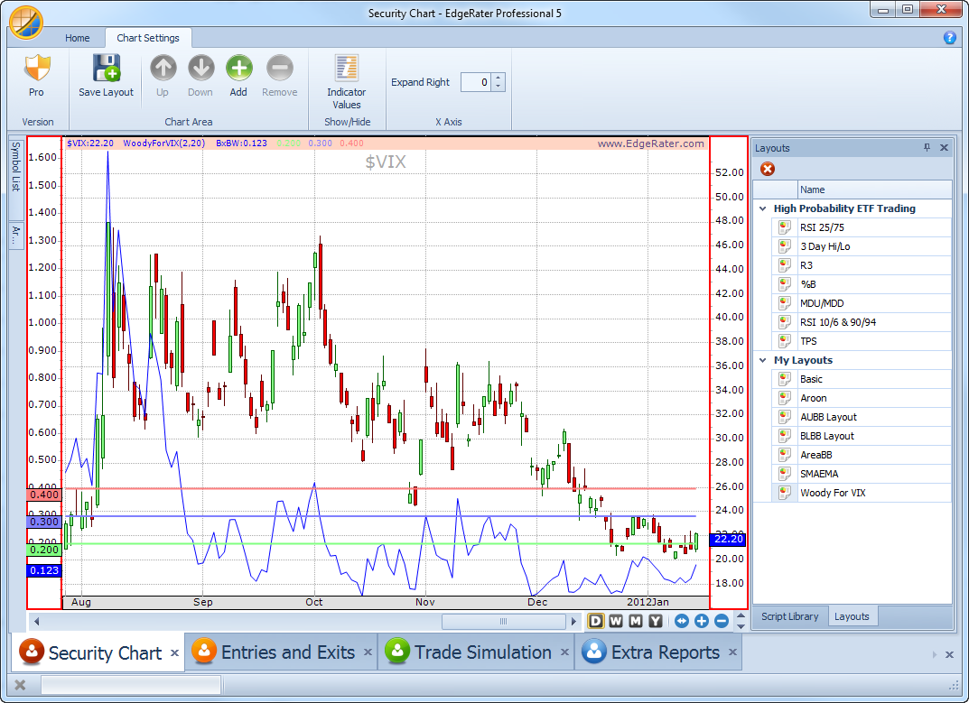
This is easy to achieve in EdgeRater given the two new indicators ‘Woody’ and ‘WoodyForVix’. All you need to do in this particular case is set up a chart layout which has WoodyForVix as an overlay – here’s what that will look like:
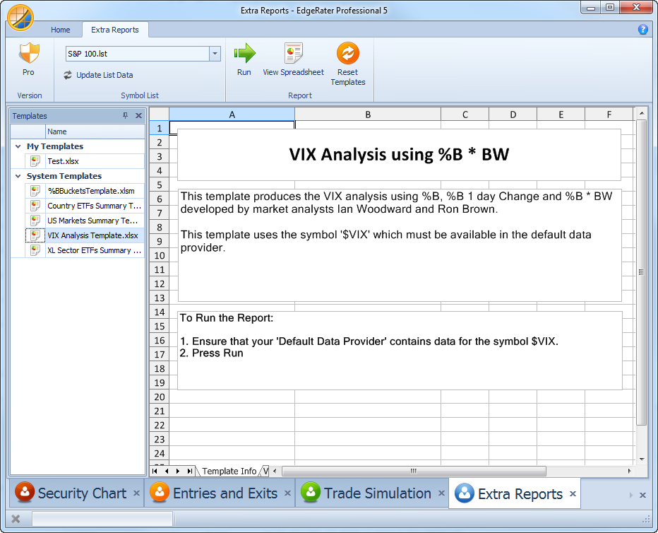
Once this layout has been created and saved then it can easily be recalled for later use. That is the key to viewing this chart in conjunction with the new Excel Report “VIX Analysis Template”.
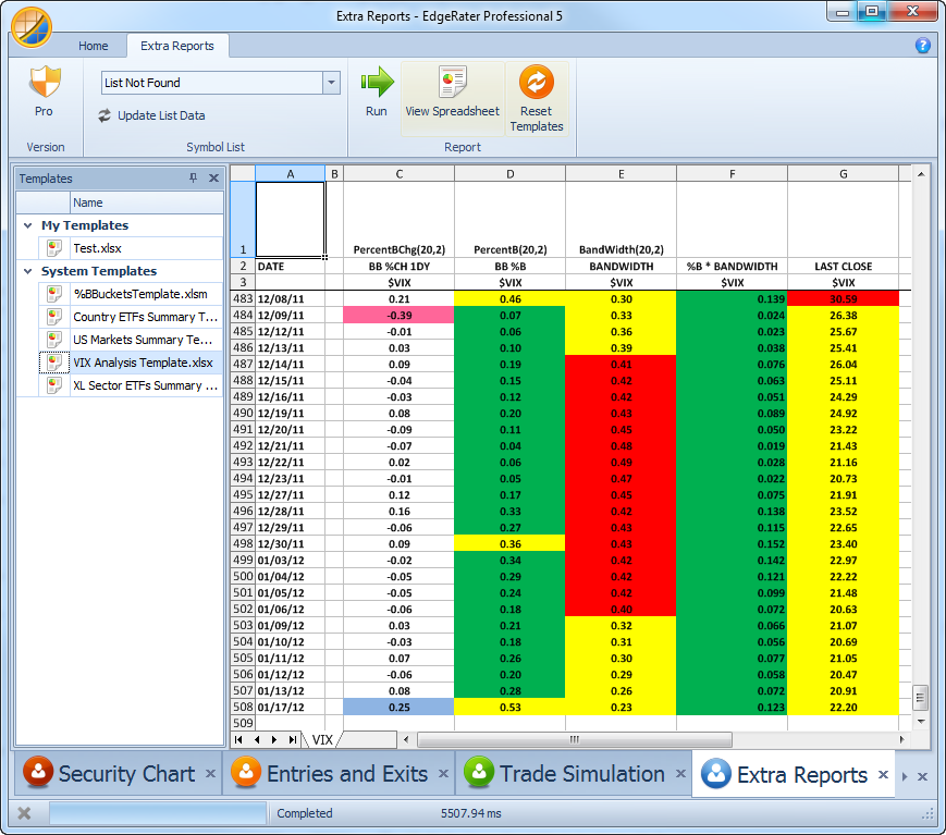
After the report is generated you can just double click in any cell in the C, D, E or G columns to show the chart with the date that was clicked on highlighted. You can also use the keyboard arrow keys to scroll through the Excel document and the chart will be updated instantly to reflect the new date row being highlighted:
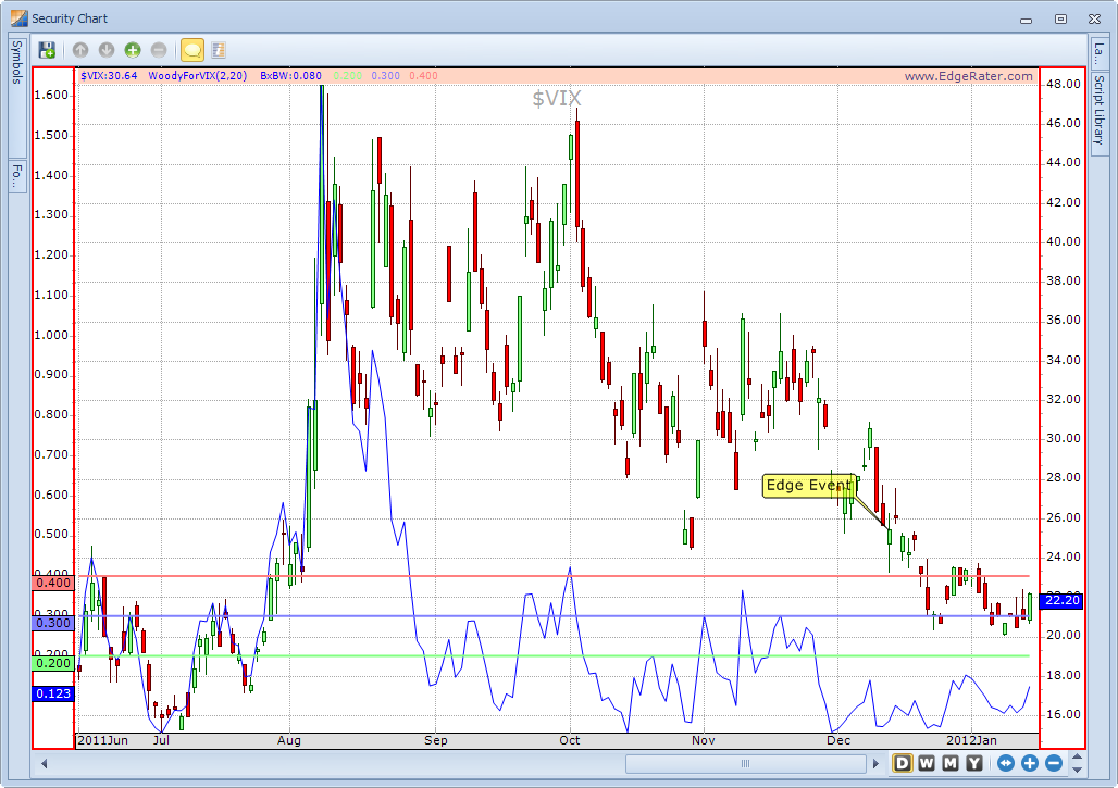
Here’s the resulting chart highlighted with the annotation ‘Edge Event’ which points to the date for the row clicked on.
That’s it – give it a try.


