Summary
Ian Woodward and Ron Brown have used the high jump tool for the past 20 years at times when the market is obviously very extended. The NASDAQ has proven to be the best market index to use. Its past history has proven to be very accurate in calling the peaks. In earlier days they used the distance from the index to the 17 DMA, 50 DMA and 200 DMA but have since found that just using the 200 DMA is sufficient and keeps it simple. This template has been designed to give a feel for where the market stands now using the past history. It is only meant as a guide. The 5 highest peaks in the High Jump are calculated and shown in the template along with the current value so that you can immediately see how far you are away from past targets.
One caution is that you can’t keep going forever as greed can become too much greed. Use the accompanying High Jump chart to look for divergences.
The Template
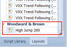
To visualize what this template shows you, first take a look at the new chart layout under the ‘Woodward and Brown’ layouts:
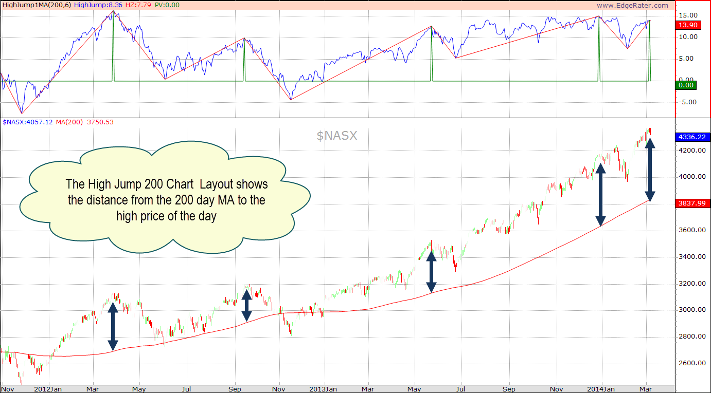
Selecting the High Jump 200 Chart layout shows a chart similar to the following:
The upper area of the chart shows the distance from the 200 MA to the high price of the day. Peaks and troughs are drawn in at turning points. The idea is that we should watch for the current high jump level to see if we are nearing any of the previous highest peaks. Also we should look for divergences which occur when price is higher but the high jump is lower as is the case for the last peak shown in the image above.
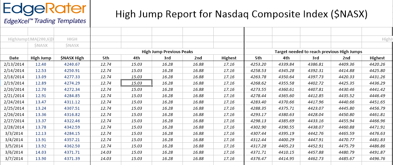
The template automatically calculates the peaks and troughs and shows the 5 highest peaks in the data range. You can easily compare the current high jump value to the previous peaks and also see what value the NASDAQ index needs to get to to achieve a jump over the peak.
Here’s an example of the template output:
This template is configured to use the NASDAQ composite index symbol $NASX. That is the HGSI symbol for the NASDAQ composite index. In order for this template to work you must have your ‘default data provider’ set to HGSI. Then when you run the template EdgeRater will query the HGSI database for the symbol and automatically generate a new data snapshot containing only that symbol. Data snapshots created in this way always have the name ‘ExcelReportSymbols’ and so you will notice that in the symbol list name also.
Running this template automatically switches your current symbol list to the auto-generated symbol list so make sure to select an appropriate symbol list again if running other templates after this one.


